BUILDING FOUNDATIONS

Designing CSA Group’s Scalable and Accessible Design System
2022 - 2024
Overview
This case study outlines how I led the creation of a flexible and accessible design system at CSA Group, modernizing workflows and transforming how teams collaborated. Upon joining CSA, I quickly realized there was no cohesive design system in place.
This discovery prompted me to build a dedicated team, develop a strategic approach, and introduce structured, iterative processes to establish a strong foundation of consistency, accessibility, and efficiency.
Key highlights include conducting a thorough product audit, prioritizing accessibility from the very start, implementing flexible design tokens, and establishing robust governance processes. These efforts helped ensure the system’s long-term success and served as a catalyst for organization-wide collaboration.
Impact
The design system has revolutionized digital workflows at CSA, enabling faster delivery of consistent, high-quality designs across multiple product teams.
By introducing standardized components and practices, redundant work was eliminated, communication channels improved, and accessibility was woven into every aspect of the design process.
Over time, the system has grown to include more than 275 components and 52 styles, actively used by 19 teams with 3,300 component inserts—and counting.
Context
The Canadian Standards Association (CSA Group), an organization with over 100 years of history, was seeking to modernize its digital products. When I joined, I discovered there was no consistent design framework or unified approach to accessibility. Designers and developers often worked in silos, re-inventing the same patterns with inconsistent, sometimes inaccessible results.
Recognizing the need for a scalable and accessible design system, I first secured leadership support to form a small yet dedicated team that could tackle these challenges head-on.
Objectives
Standardize design components, styles, and workflows across CSA’s digital ecosystem.
Prioritize Accessibility by building inclusive design principles into every component from the outset.
Create a Scalable and Flexible System to adapt to the evolving needs of product teams.
Establish Governance to ensure long-term adoption, maintenance, and continuous improvement of the design system.
Role
Design Lead – Oversaw the strategy, execution, and governance of the design system.
Team
Design Lead
2 Product Designers
1 Front-end Engineer
Timeline
Foundational work began in 2022 and took place over two years, with ongoing enhancements and scaling efforts continuing to refine the system further.
LAYING THE GROUNDWORK
Starting with a Comprehensive Audit
After assembling my team, our first major task was to audit all existing products to identify both commonalities and inconsistencies in the user interfaces.
I also made sure we were prioritizing accessibility from the start—ensuring our system would meet and one day, exceed WCAG standards.
During the audit, we discovered:
Outdated, duplicated, and inconsistently named Figma components.
Widespread accessibility issues, including low-contrast colour palettes and unlabeled interactive elements.
Focusing on quick wins, such as standardizing colors and typography, helped us build early momentum and earn trust from stakeholders who saw immediate, tangible improvements.
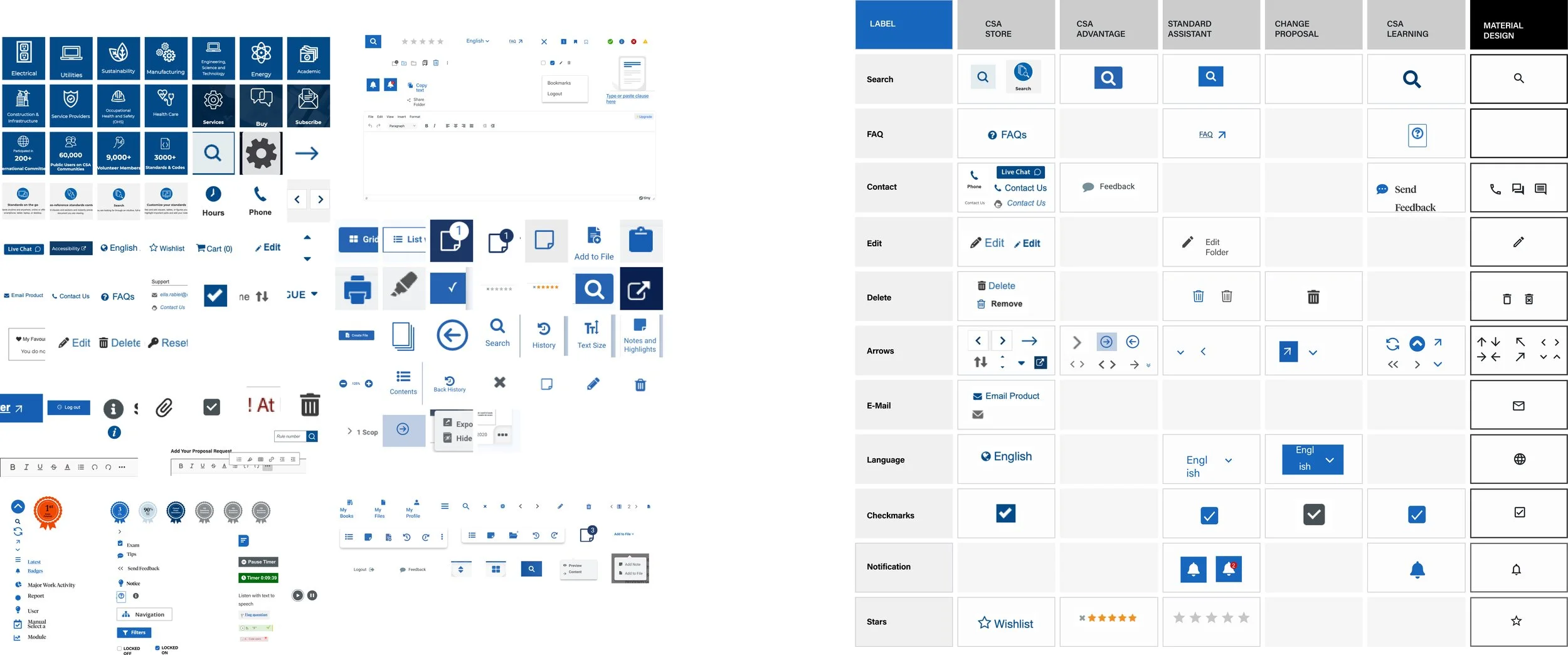
Audit of icon usage in various products (left), Process of synthesis and prioritization (right)BUILDING FOR FLEXIBILITY
Leveraging Atomic Design and Figma Enterprise Features
We adopted an Atomic Design methodology, breaking down the UI into a hierarchy of atoms, molecules, organisms, templates, and pages.
Specifically, we focused on:
Colour: Establishing accessible and consistent palettes.
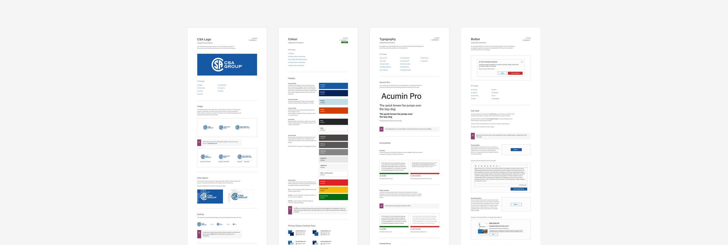
Typography: Defining clear type scales and styles.
Reusable Patterns: Creating modular components that could be combined to form more complex layouts.
For instance, our button components went through iterative rounds of testing, ensuring colour contrast met accessibility guidelines and focus state was perceivable across products.
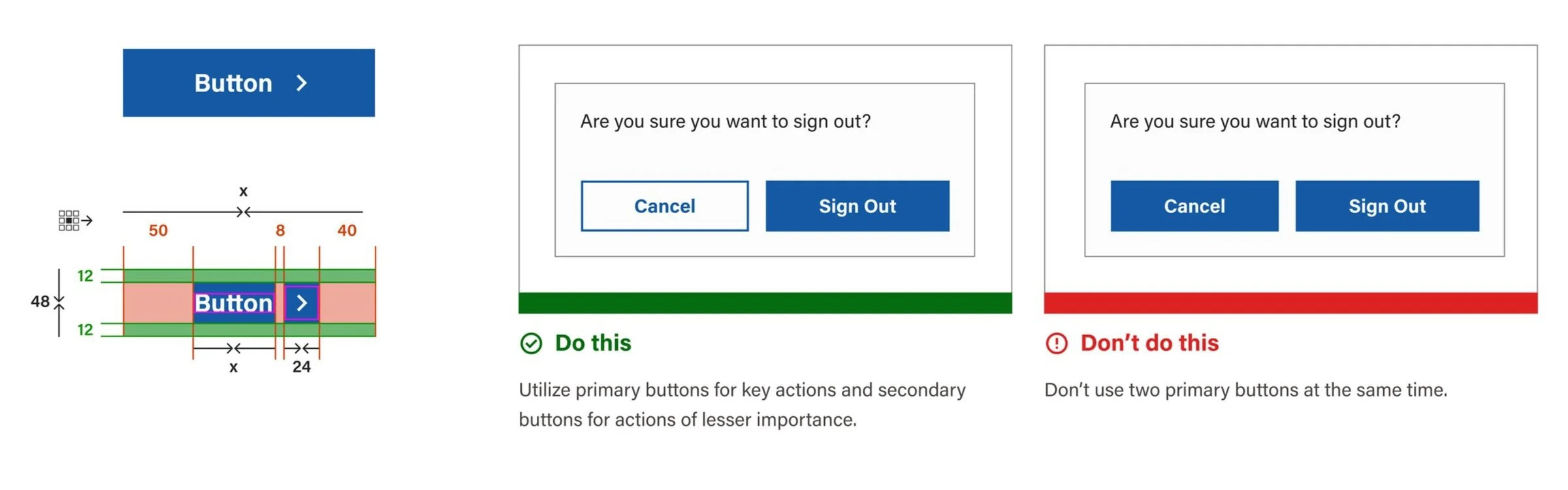
Button anatomy (right) and documentation example (left).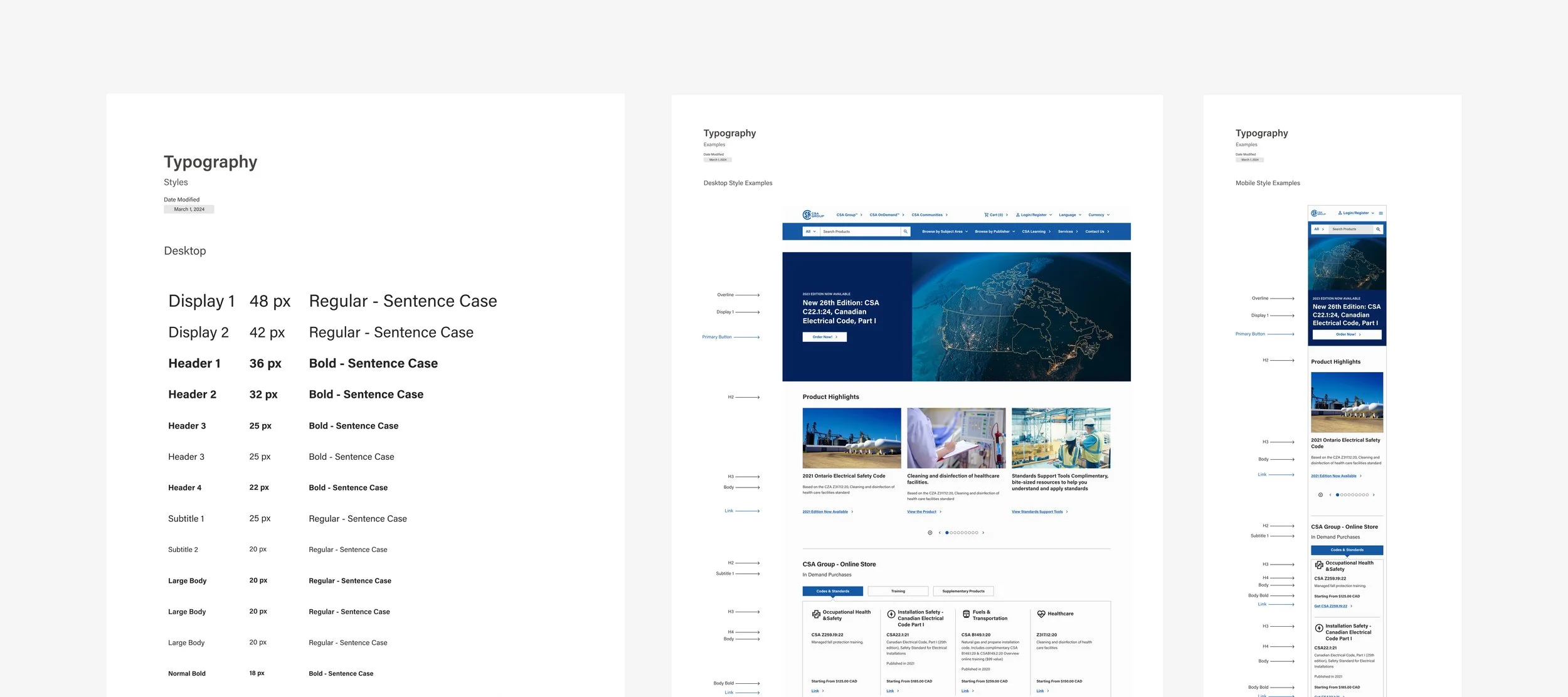
Typography DocumentationFigma Branching & Development Collaboration
To facilitate continual iteration without disrupting active workstreams, I set up branching in Figma Enterprise. This allowed designers to propose changes to shared components, gather feedback, and merge finalized updates.
Simultaneously, I worked closely with our developers to ensure they understood the impact of design changes, finding efficiencies so that new or updated components were integrated into sprints with minimal friction.
OPERATIONS
Establishing Processes to Evolve the System Together
With the initial audit complete, we turned our attention to building a sustainable collaboration and contribution workflow.
I introduced:
R.E.A.D. in Figma: A framework (Research, Explore, Apply, Document) that guided our daily design activities.
Jira for Sprint Management: Centralizing requests and bugs into one backlog allowed us to prioritize updates, fixes, and new component contributions based on business needs.
To keep our team aligned and adaptive, we iterated on these processes continuously—tweaking how we documented components or managed sprints based on real-time feedback.
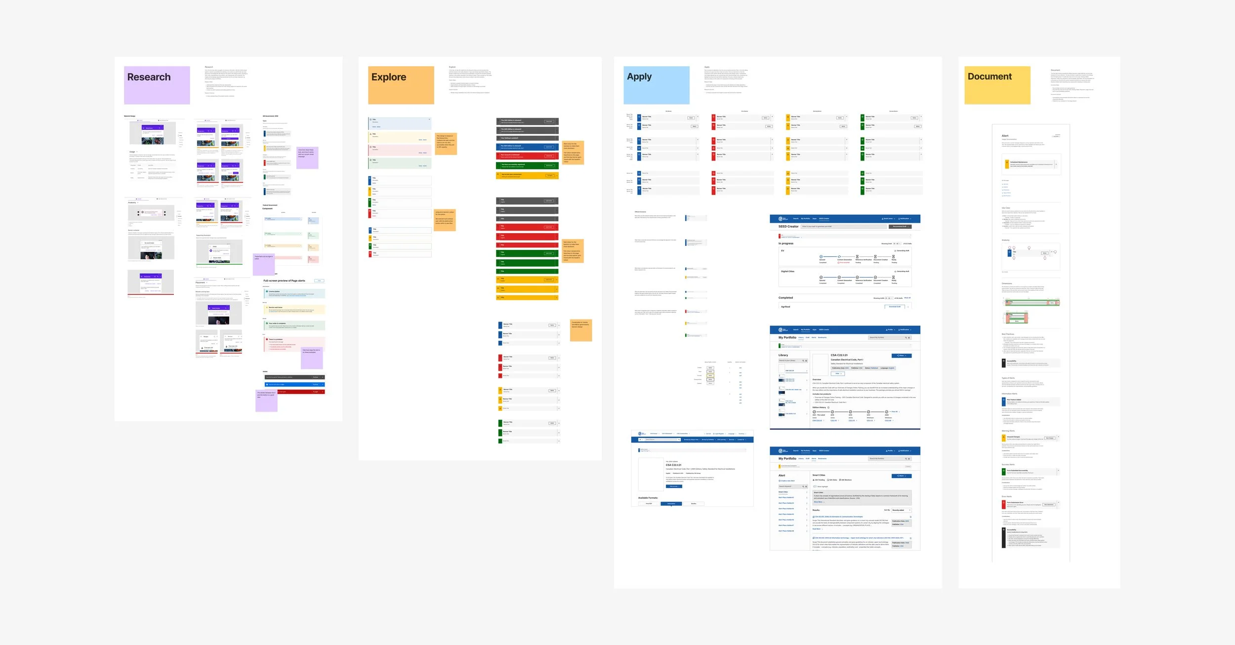
R.E.A.D. (Research, Explore, Apply, Document) Process example for AlertEVOLVING THE SYSTEM
Communicating and Empowering Teams
A central objective was ensuring every product team at CSA could confidently use and contribute to the design system. To achieve this, I:
Gave multiple presentations and memos demonstrating how to adopt and integrate the system.
Created a contact form, dedicated email, and internal FAQ to have a wide diversity of ways I could handle questions or issues, ensuring no roadblocks would go unresolved.
Organized knowledge-sharing sessions where designers and developers could showcase best practices and troubleshoot challenges collaboratively.
These channels greatly improved visibility, trust, and engagement, leading to increased system adoption across the organization.
“The design system guidelines were very intuitive and easy to follow! We do not often see customers with this level of brand depth so it was exciting for us to have such a foundation from which to design the proof of concept.”
Intranet Platform Vendor
MEASURING SUCCESS
Progress and Growth
By establishing a clear governance process, our design system quickly gained traction within CSA. Some key metrics illustrate its impact:
Over 275 components in our Figma libraries, supported by 52 styles such as color tokens and typography scales.
Adoption by 19 product teams, resulting in 3,300+ component inserts into live projects.
Significant reduction in design and development redundancies, allowing teams to launch products faster.
We continued to gather feedback through sprint retrospectives, component usage metrics, and direct input from product teams.
These data points guided our strategic roadmap, ensuring we continuously refine both our components and our processes.
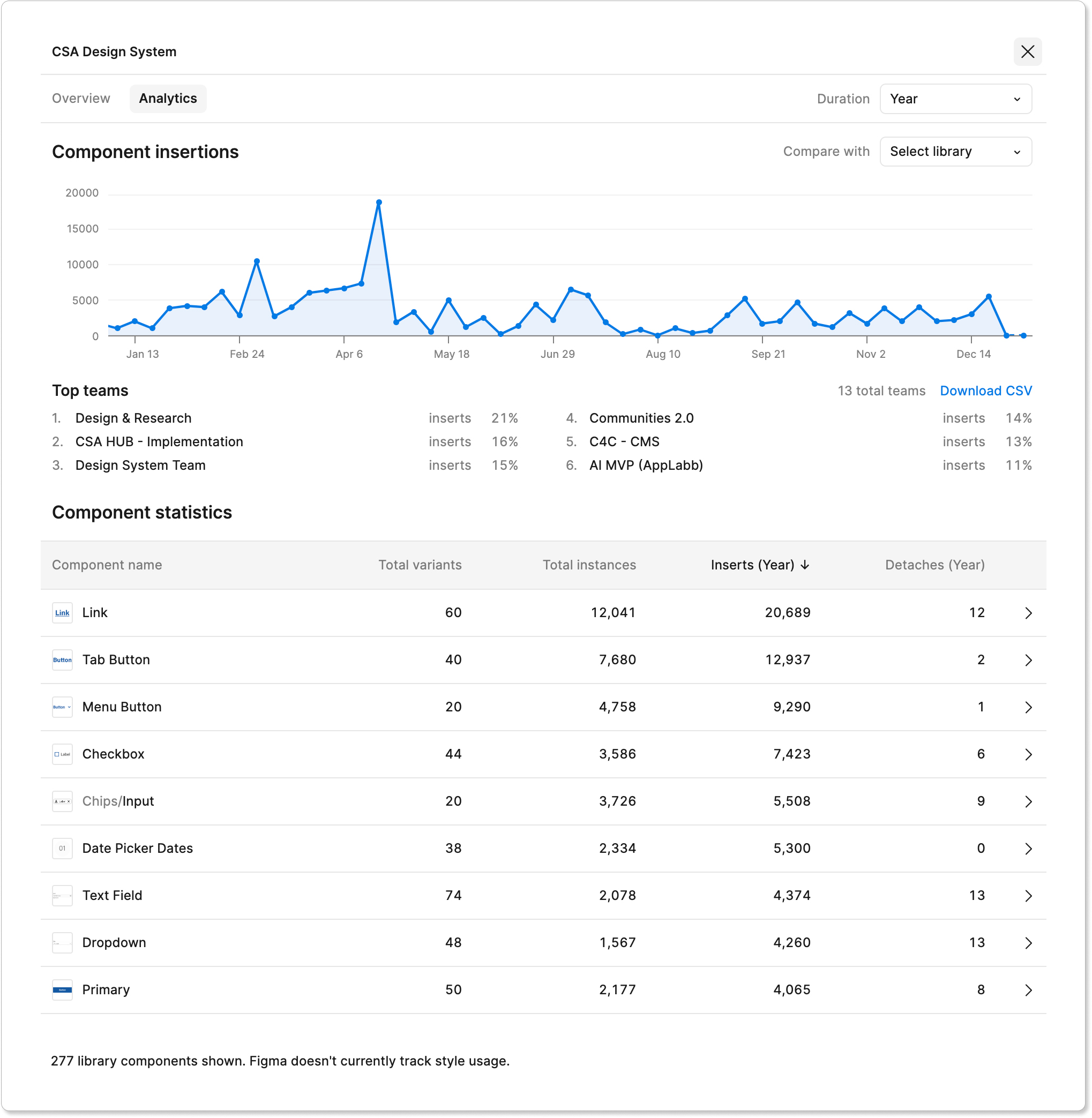
Design System Library AnalyticsDEMONSTRATING VALUE
Transforming Design Practices at CSA
Introducing a unified design system to an organization with a long history required careful planning and leadership.
Integrating accessibility-first thinking from the beginning not only improved the user experience but also significantly cut down on accessibility issues during QA and launch phases.
Key benefits include:
Faster Project Delivery by eliminating repetitive tasks and consolidating best practices.
Minimized Bugs and Maintenance as standardized, tested components reduced the risk of errors.
Inclusive Design Mindset embedded into the development cycle, broadening CSA’s user reach and drastically enhancing our work for continued WCAG 2.1 compliance.
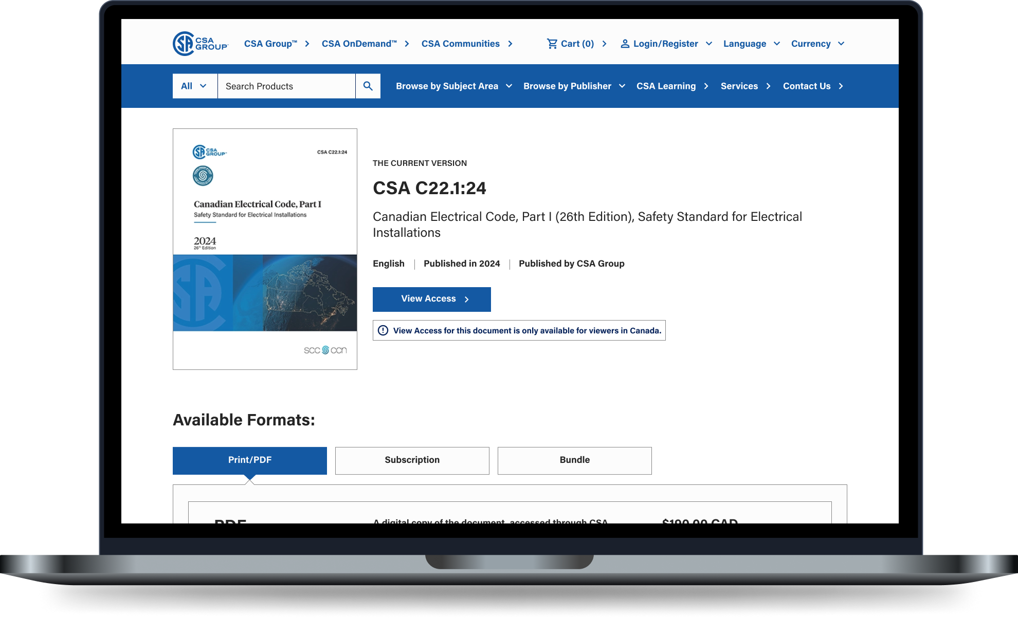
The CSA Store demonstrated significant improvement in accessibility, performing better in both manual and automated accessibility tests after implementing the design system.THE ROAD AHEAD
Scaling for the Future
After 14 months, the design system has become an integral part of how CSA teams work. However, there is still much to achieve.
To guide this ongoing progress, I developed the Digital Product Design System Maturity Model, highlighting the importance of:
Dedicated Front-end Resources: To fully implement design tokens across different platforms, ensuring UI consistency and reducing manual overhead.
Ongoing Investment: Continued hiring of specialized designers and developers to keep pace with evolving product demands.
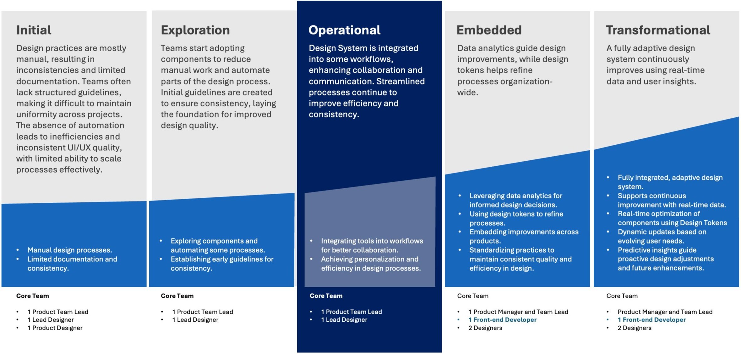
Design System Maturity Model for CSABy presenting a clear, data-driven roadmap, I was able to secure executive sponsorship to being the work to expand our core team and accelerate creation and adoption of design tokens—further establishing a single source of truth across CSA’s digital landscape, especially among out external teams and vendors.
Through iterative improvements, cross-functional collaboration, and a relentless focus on accessibility, our design system not only modernized the organization’s digital product development workflows but also set new standards for excellence, inclusivity, and innovation.
And as the system continues to mature, it will remain a cornerstone of our product development strategy for years to come.
Final Thoughts
The creation and evolution of the CSA design system showcase my ability to lead complex, multidisciplinary initiatives that deliver wide-reaching and measurable results.
By combining a commitment to accessibility with strategic prioritization, adaptable processes, and hands-on design leadership, I laid the foundation for a scalable system that addresses both immediate needs and long-term objectives.
This project is more than a design system—it’s a model for how to integrate accessibility, efficiency, and collaboration into every stage of product development.
Through this effort, CSA gained not only a better design workflow but also a sustainable approach to creating inclusive and innovative digital products.
The work continues, but the impact already highlights the value of thoughtful, strategic investment in accessibility from the very start of the product development process.